The items described below are the most important UX issues to consider when designing an application for Series 40 full touch. Many of the 'checks' are solved automatically when using ready-made views like 'lists', but they remain an issue for custom views.
| UI controls |
Obey minimum touch area |
|---|
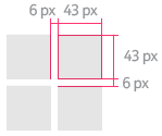
Figure 1. Minimum touch areas and margins
|
- Minimum touch areas:
- UI element: 7mm x 7mm, i.e. 43x43 pixels.
- Gap between elements: 6 pixels, i.e. 1mm .
- People tend to press a bit lower than the actual center of the item.
- People on the move operate the device with one hand and with a thumb.
|
| Visual feedback |
Indicate all touch down events |
|---|
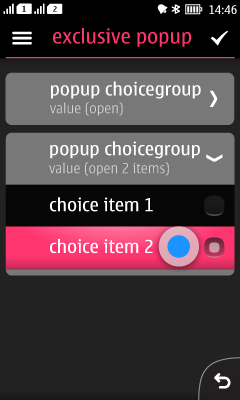
Figure 2. Visual feedback of a popup choicegroup item while being pressed
|
- React to people’s actions.
- Touch down feedback is easily forgotten for custom UI elements.
- Indicate the touch down event – not the touch release.
- If the application behaves in a different way, people may perceive the application as broken.
|
| Base layout |
Don't hide the chrome permanently |
|---|
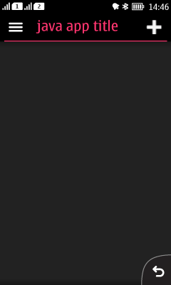
Figure 3. Basic chrome; status bar, header bar, and back button
|
- Status bar contains important information, such as battery strength, and the user needs it to access the notification bar and other information.
- Notification bar is not available in landscape orientation.
- Header contains options list icon, informative title and optionally the primary function icon.
- Action button 1 (right) is the primary action in the view.
- Action button 2 (left) is options list, providing access to secondary actions.
- Always populate action button 2. In case the options menu is empty and there is no secondary action, the options list icon is shown dimmed.
- Place the primary action as an options item in case there is no proper icon metaphor available.
- Test your application in both portrait and landscape, if you don't lock the orientation.
- More information: Base layout, Header bar, Backstepping.
|
| Category bar |
No actions in category bar |
|---|
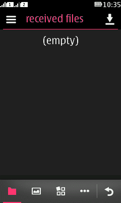
Figure 4. Category bar and Category bar extension 
|
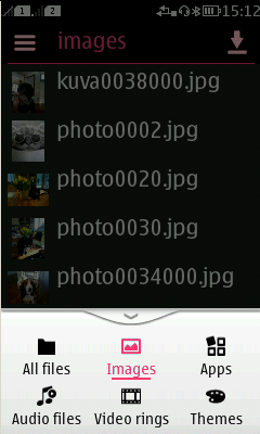
- Categories are used to provide visibility and navigation between different sub-apps, functionalities or modes within an app.
- The functionality of category bar can be compared to tabs.
- It is not used for representing commands.
- The currently active category is highlighted.
- If there are more categories than what fits to the category bar, the categories are accessible via the category bar extension.
- Back is part of the Category bar, positioned at the right most location.
- More information: Category bar.
|
| Back navigation |
Back also means 'Cancel' |
|---|
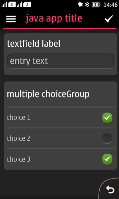
Figure 5. Form with 'Check mark' and 'Back'
|
- Back button implies that people want to stop their task.
- Abort the action.
- Set everything back to previous values.
- If the user makes changes to any values and then presses 'Back', it's recommended to show a confirmation query.
- Ensures the user does not loose important data or settings.
- Does not come automatically, must be implemented into the app.
- In forms, place a check mark in Action 1.
- Check mark works as the opposite function to 'back' , i.e. 'Ok' or 'Done'.
- No query necessary for 'accepting' a form by pressing the check mark.
- More information: Backstepping.
|
| Options list |
Secondary commands to Options list |
|---|
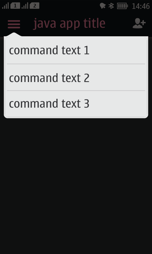
Figure 6. Options list (image to be updated)
|
- Options list contains commands that apply to the entire view.
- The most frequently used commands should get higher priority.
|
| Long press options list |
Long press options list is never the only way to access a command |
|---|
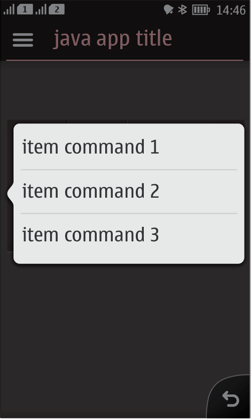
Figure 7. Long press options list (image to be updated)
|
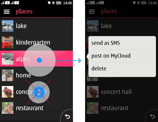
- Contains item specific functions only.
- First time users might not realise the existence of long press gesture.
- Repeat the long press options list items in the next view as primary function, or as secondary functions in the view's Options list.
|
| Full screen |
Provide all needed commands on-screen; via options list or directly on the canvas |
|---|
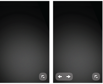
Figure 8. Full screen application with interactive elements
|
- There are two types of full screen apps.
- Interactive elements on the main screen:
- Chrome is hidden.
- Back button is replaced by a ‘show chrome’ button.
- There can be other floating elements visible in full screen view.
- No interactive elements on the screen:
- Apps do not display any ‘show chrome’ button.
- Chrome is simply revealed by a tap anywhere on the screen.
- All chrome elements should time out if the chrome times out and the application switches to full screen view.
- Always include a back button in a normal view.
- More information: Full screen view.
|
| Hardware keys |
Red end key always closes the application or data connection |
|---|
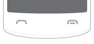
Figure 9. Green 'Send' key and red 'End' key at the bottom of a Series 40 phone
|
- Pressing the red End key has two main functions in addition to closing a call:
- Disconnect the data connection.
- Close the application.
- If there is a data connection established:
- 1st press: Cuts the data connection.
- 2nd press: Closes the application.
- If there is no data connection established:
- 1st press: Closes the application.
- Confirmation note on 'exit' is recommended in case the user might loose data or it requires a reasonable time to reload the application.
- More information: Send & end key.
|
| Icon sizes |
Use correct size |
|
|
|---|
Figure 10. Canvas and icon size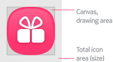
|
Icons |
Size |
Canvas |
| Grid menu icons |
56x56 |
50x50 |
| Menu icons |
38x38 |
28x28 |
| Menu icons_sc |
38x38 |
28x28 |
| One row list icons |
38x38 |
28x28 |
| Category bar |
36x36 |
20x20 |
| Category bar extended |
26x26 |
20x20 |
| Header bar icons |
32x28 |
20x20 |
| Alerts (dialogs) |
Avoid confirmation notes where possible |
|---|
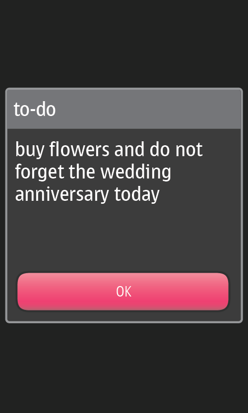
Figure 11. NOTE! To be replaced with a 'good' example!
|
- If the change can be clearly understood from something else visible, notes are not needed.
- Combine several queries which follow up each other into a single query.
- Explain all the different issues in one alert.
- Ask for permission from the user to execute the entire task only once.
- More information: Alerts and pop-up lists, Confirming changes.
|
| Cost awareness |
Indicate if your application is causing costs |
|---|
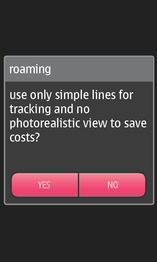
Figure 12. A query helping to control the costs
|
- Inform if actions require cost sensitive connection.
- Give a chance to cancel the task.
- Alerts should not be used as "selection lists".
- Do not hide the status bar, show the connectivity status.
- You may want to offer different connectivity options.
- Using automatic connection.
- Manual updates, where the user would totally control when update is needed.
|
| Gestures |
Do not use double tap, and reserve long press for the item related menu |
|---|
Figure 13. No double tap; use long press only for opening the long press menu
|
- Series 40 full touch UI is using double tap only for zoom.
- People will not anticipate any other functionality related to this gesture.
- Even if the application introduces this gesture, it will feel artificial.
|
| Monetization |
Tell the price before the purchase begins |
|---|
Figure 14. Basic purchase flow
|
- Clearly show what is available
- Clearly state the price of each available item
|
